Netflix
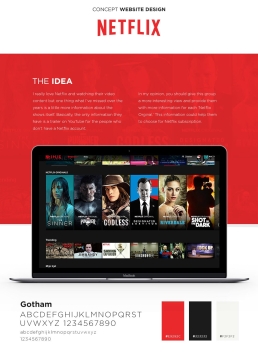
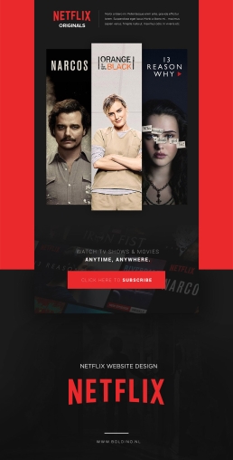
When I was working at Isobar I had an idea for Netflix. I do love the platform Netflix but in my opinion, they could do more around the information and interaction of a show in general. Nowadays they do everything on Social but in my opinion, they could combine their platform together with a more editorial information platform with more information around each ‘Netflix Original’
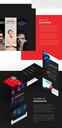
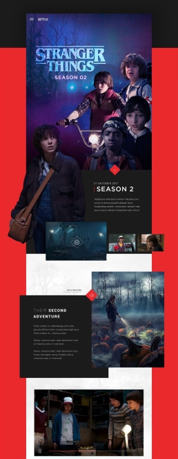
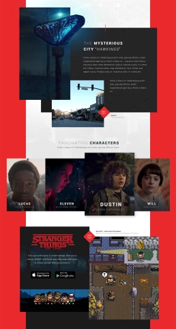
At that time we were already working for Netflix and I pitched it to my former Creative Director and he was really positive. So I created this page where I took ‘Stranger Things’ as an example. But the idea was that this website was built out of blocks and components so it’s easy to set up but on the other hand it doesn’t look blocked and stacked at the same time. I need to express a creative feeling.
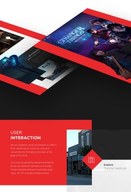
This platform also used interactive elements in where the user can take their own route and choose whatever they like to see at that time. The site could be filled with background stories around the shooting of the episodes, more information about the location and the location scouts, or extra content like 360 images of the set, or interviews with actors or other crew members. With these things, you’re building a better relationship with the people that are watching the show and it also gives these people a more and warmer relation towards the show. They are involved!
ClientNetflixServicesArt Direction, Design, ConceptYear2017
